
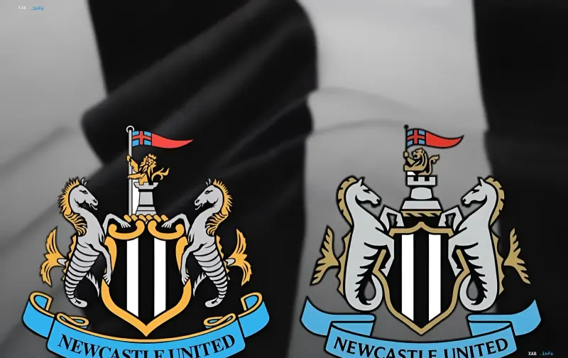
Football club Newcastle United has officially unveiled a newly updated club crest, changing its design for the first time in 38 years. This decision by the club's management marks a crucial step in implementing a long-term development strategy and modernizing its visual identity on the global sports stage.
Background and Design Details
In the newly presented logo, designers retained the key historical elements traditionally associated with the club for decades. The crest still features the recognizable black and white stripes, the majestic castle symbolizing the city's heritage, fierce lions, and the flag of St. George. However, all these components have been thoroughly styled and adapted to modern digital standards and merchandise.
Historical Context and Legacy
It is worth noting that Newcastle boasts a rich history with four English top-flight league titles won in the early and mid-20th century (1905, 1907, 1909, and 1927). In the Premier League era, the team has yet to claim the ultimate championship trophy, but recent years have seen the Magpies return to the elite of European football.
Controversial Data
While official club sources and major sports outlets report that the badge has been updated for the first time in 38 years (since 1988), some historical archives hint at minor cosmetic tweaks made in the late 20th century. Nonetheless, current experts view this redesign as the most substantial overhaul of the club's identity in decades.
Current Season and Prospects
This new chapter coincides with the start of the current Premier League campaign under new head manager Matthias Jaissle. The team has shown mixed results at the start, balancing bright victories and draws, requiring maximum concentration from the revamped squad.