
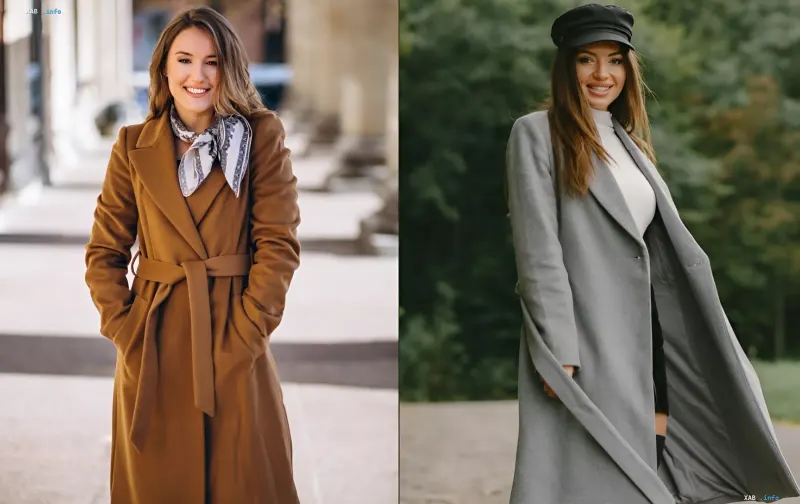
A new caramel-colored trench coat or a sweater in a warm reddish hue may look wonderful on a hanger, but a very different story unfolds when it's worn on a person. Especially if the color of the clothing doesn't harmonize with your natural skin undertone. That's exactly why, before buying the next 'autumn' sweater or trench coat, you should look not only at the trends but also at how a given color actually changes the look of your face. Stylist Elena Shevchenko broke down popular autumn shades and their more flattering alternatives in an Instagram post, which was referenced by the project Styler from RBC-Ukraine.
Why the Color Near Your Face Matters So Much
According to the specialist, the color of clothing near the face matters not only from a fashion standpoint: it affects how the skin tone is perceived visually. That's why Shevchenko advises paying attention to the 'temperature' of a shade and not buying an item just because it's particularly popular. The key principle the stylist offers is to assess whether a shade makes your face look fresh or, on the contrary, dull and tired, and to base your choice on your own skin undertone rather than on fashionable runway palettes.
Terracotta and Khaki: the 'Tired' Shades
Warm terracotta, in Shevchenko's assessment, can pair unsuccessfully with a cool skin undertone and make the face look visually duller. As an alternative, the stylist advises trying a wine or berry shade: these also fit well into the autumn palette but can look more defined against a cooler skin tone. Another popular autumn color — swampy khaki — can, according to the specialist, visually give the face a tired look. Instead of it, Shevchenko suggests choosing a deep coniferous, rich green shade.
Caramel and Reddish: Popular, but Not Always Flattering
Caramel and reddish shades traditionally become especially popular in autumn. However, if a warm color makes your face look visually tired, you should look for another option. Shevchenko advises paying attention to a cool taupe or a neutral camel: such shades, in her words, help maintain a restrained, 'expensive'-looking autumn palette without excess warmth near the face. It is precisely these muted, neutral tones that the stylist puts forward as the main alternatives to the 'warming' caramel and reddish hues.
How to Wear a Trendy Color If It Doesn't Suit You
The stylist notes that you don't have to completely give up trendy colors. If a shade doesn't suit you near the face, you can keep it in the lower part of your outfit — in trousers, a skirt, or accessories below the waist — and use a color near the face that better harmonizes with your appearance. This way, the trendy element is preserved in the look but no longer affects the perception of your skin. The bottom line is simple: before buying an autumn piece, try on not only the size but also the 'temperature' of the color near your face, so that a fashionable shade refreshes rather than ages you.