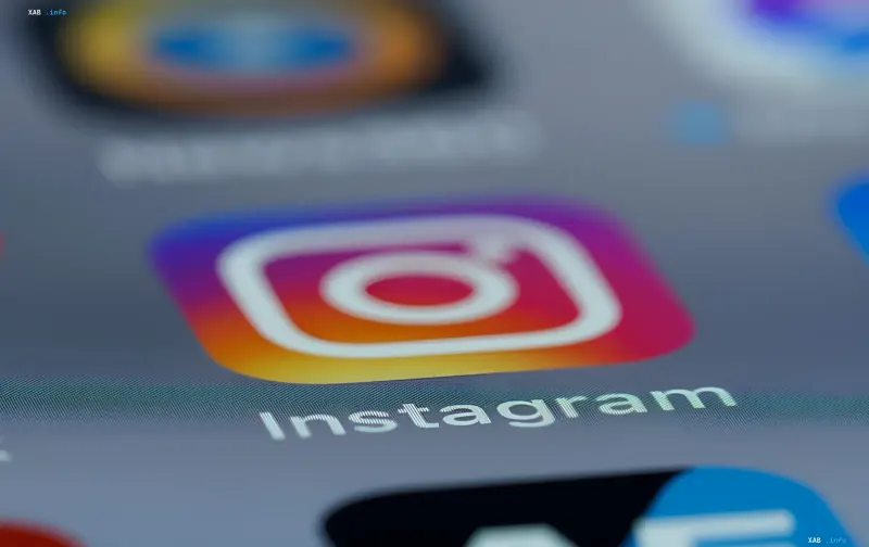
In August 2026, one of the world's most recognizable social networks, Instagram, officially unveiled a redesign of its wordmark. This is the brand's first major style update since 2016, when the company abandoned the classic camera icon in favor of a gradient palette. Instagram CEO Adam Mosseri stated that the new visual identity aims to make the platform more "sharp and modern" while maintaining a connection to the brand's history.
Style evolution: from camera to handwritten script
The new Instagram logo is a wordmark executed in a style reminiscent of handwritten cursive. Designers added characteristic curls to the letters 's', 'r', and 'g', giving the mark a more "human" and dynamic look. Mosseri emphasized that the goal of the update is not just a change of image, but an adaptation of the brand to the changing realities of the digital age. The gradient icon, which became the symbol of the platform in 2016, remains unchanged, but it is now accompanied by an updated text element.
User reaction: from delight to jokes
The update sparked a lively reaction on social media. Some users appreciated the fresh look and praised the font choice, noting that it looks more organic and modern. Others, conversely, expressed dissatisfaction, calling the changes excessive. Special attention was drawn to the shape of the letter 'r', which, due to its curl, began to resemble the letter 'z'. Memes quickly appeared online where the platform's name is read as "Instagzam". Despite this, experts note that the brand's recognizability is so high that most users will still identify the logo without error.
Cursive as a cultural code: why does this matter?
The choice of a cursive font is not accidental. It alludes to the traditions of handwriting, which are increasingly becoming part of the retro aesthetic in design. However, as experienced users note, this decision may be incomprehensible to younger generations who are no longer taught cursive writing in schools. For them, a shape resembling a boat's sail may be perceived as an abstract element rather than the letter 's'. This creates an interesting cultural gap between generations, which may become part of the discussion about the future of design in the digital age.
Contradictory data
While Mosseri's official statement confirms that the redesign was initiated by Meta itself, some sources suggest that the decision may have been made under pressure from internal marketing research. At the same time, other experts believe this is part of a broader strategy to update all Meta brands, including Facebook and WhatsApp. For now, Meta has not commented on whether other changes to Instagram's design can be expected in the near future.
Historical context: why was 2016 a turning point?
The last major Instagram design update occurred in 2016, when the company abandoned the classic brown camera with a rainbow stripe in favor of a bright gradient. This decision became a turning point in the brand's history, as it allowed Instagram to become more universal and suitable for various platforms. The new 2026 logo continues this tradition, emphasizing minimalism and adaptability.