The Psychology of Color in Landscape Design: Alan Titchmarsh's Advice
In the context of urbanization and rising land costs, the issue of effectively utilizing small areas is becoming increasingly relevant. Renowned British gardener and TV presenter Alan Titchmarsh, whose landscape design tips are considered the gold standard, offers a simple yet brilliant solution for visually expanding space. According to him, the key to increasing the visual perception of a plot lies not in complex re-planning, but in the correct choice of fence color. This life hack does not require significant financial investment but can radically change the perception of the territory.
Light Tones: A Universal Solution for Small Spaces
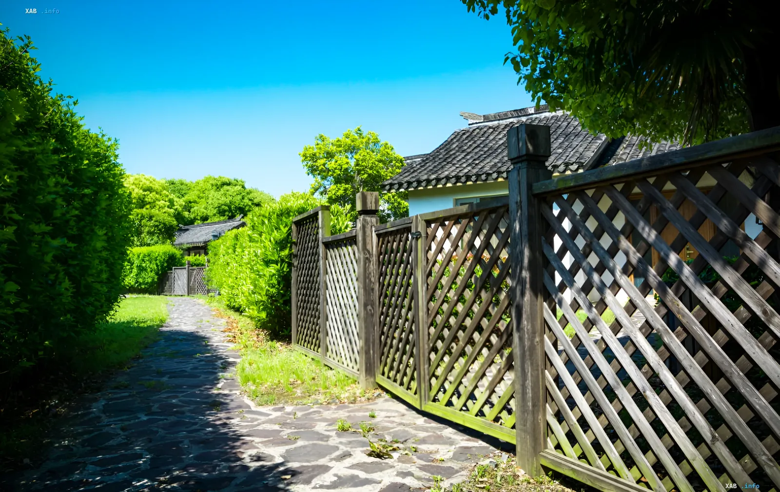
For small and medium-sized plots, Titchmarsh strongly recommends using light shades when painting fences. The main principle here is that light colors do not attract excessive attention, allowing the boundary of the territory to "dissolve" into the space. As a result, the observer's gaze does not fixate on the limiting lines, and the yard appears more open and airy. One of the most universal options, according to the expert, is light gray. It is especially effective in combination with abundant greenery: against such a neutral background, leaves, flowers, and decorative shrubs look brighter and more expressive, becoming the main protagonists of the composition.
Dark Accents: When the Fence Should Disappear
There is also an opposite strategy applicable in specific conditions. If tall trees or dense shrubs grow along the fence, Titchmarsh advises using dark gray or even black for the enclosure. In this case, the dark background works as a visual device to recede into the background: the fence is perceived as a shadow or a natural part of the landscape, rather than an artificial barrier. This allows plants to become the dominant element, creating an effect of depth and coziness. This approach is particularly appropriate where the fence should not be an independent decorative element, but merely serve as a functional boundary.
Working with Brick Walls and Material Protection
The rules for visual correction of space change when it comes to solid walls. Titchmarsh emphasizes that old beautiful brick is better left unpainted, as it can become an ideal natural background for climbing plants. However, a new massive brick wall can visually weigh down a small space. In such cases, it is recommended to use neutral paint in lighter shades to soften the perception of volume. Another method is using structures for climbing plants, which over time will cover part of the wall, making the boundary of the yard less sharp. Furthermore, painting performs an important protective function: an uncovered wooden fence will eventually rot and decay under the influence of weather conditions.